The Psychology of Colour in Brand Experience
The way people perceive and ascribe meaning to colour is one of the most fascinating areas of neuroscience and brand experience design. For decades, marketers and UX designers have wrestled with the challenges of combining a brand and its presentation and unique brand codes, with the touchpoints we present to users, & how to create the right mood and tone through design.
The difficulty has been in no small part down to a lack of solid scientific study of the problem, which itself was hampered by the lack of technologies able to directly watch what happens in a person's brain when they perceive things.
That's something which as been steadily improved however, since about the mid 90's. In this guide we're going to take a look at how colour works, three of the best studies on colour perception and interpretation that we've seen, and what the findings mean for UX and marketing professionals today.
How Colour Works
So before we dive in to the studies, firstly let's begin with a little colour perception theory. We can think of the world in terms of three primary conceptual colours, then the three secondary colours, which sit between those, and finally the six tertiary colours which sit in between all those six.
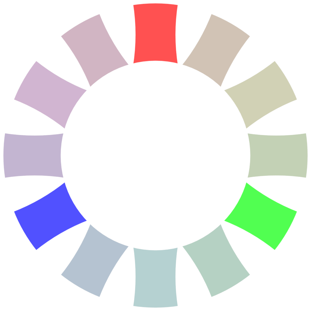
We can then take this one step further, using the Munsell colour system, to add in value and chroma. Value is how light or dark the colour is, and chroma is the level of saturation.


Through a system like this, we can express any colour you can think of. Pastels to match a sunset or high-end restaurant décor, bright colours like those of children's toys or fast food restaurants, deep, rich colours like wines and chocolates... Anything you can think of.
Colour Palettes
When you search the internet for colour theory, you'll see a lot of talk about triadic colours (three forming a triangle on the colour wheel above, like red, green and deep blue), complementary (opposites, like red and cyan or blue) and analogous colours (closely related hues). However, as we can see from the Munsell system, that misses out chroma and value. Whilst methods like this are a quick and easy way to get something that looks reasonable, don't be afraid to spend time looking at how you can modify different values to get a richer palette to play with. Often, you'll find it adds a richness that otherwise would be lacking.
It's worth noting that colour theory doesn't end here. However, going into any more depth risks becoming needlessly complex...
The Science
So with hopefully enough of a foundation, let's take a look at how people interact with colour, and what science can tell us. Starting with...
The Language of Colour
The human eye and brain are capable of distinguishing and differentiating around two hundred different shades of red, green and blue. Combined, that means the average human can see around ten million different colours. So you'd expect people across cultures to have certain set understandings for how to talk about the colour of objects. The words might be different, but surely everyone has words for red; green; blue; brown; black; white, and for different shades and hues.
Well, whilst that might make sense, it seems the ways our cultures have coded colour into language may point to some interesting clues as to how our brains work.
"When we look at it, it turns out it's the same across every language that we studied. Every language has this amazing similar ordering of colours, so that reds are more consistently communicated than greens or blues," says Edward Gibson, an MIT professor of brain and cognitive sciences.
Gibson began the study which would turn into the paper "Color naming across languages reflects color use" whilst investigating how colours are described by members of the Tsimane' tribe in Bolivia. He found that most Tsimane' use words to describe objects which are white, black, and red in a consistent manner. For anything else though, people would start to disagree with each other as to what something was. Working with a team of researchers, they asked 40 Tsimane' to give the colour names of 80 colour chips, coloured in various shades and hues to give a representative sample of the colour spectrum.
They compared their data against the World Color Survey, a Berkeley study of the descriptions of colour names as described by peoples with mostly unwritten languages, spoken in pre-industrial cultures that have had limited contact with modern, industrialised society. What they found was fascinating; no matter where people came from, they invariably have more names for warmer parts of the colour spectrum than cooler parts.
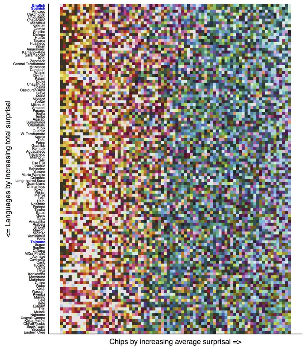
To understand why, the group then turned to a Microsoft compiled database of 20,000 images, all labelled and tagged to allow for data analysis. They found that interestingly, warm colours tend to appear in the foreground of an image, whilst cooler colours exist in the background.
"...they're all the stuff that we interact with and want to talk about," Gibson says. "We need to be able to talk about things which are identical except for their color: objects."
This fits with Bevil Conway's findings detailed in the paper "Neural basis for unique hues", which found that the largest neuron clusters in monkey brains for colour perception was tuned to red. Green came second, and then blue. A small cell network also cared about yellow. Human brains may well work in a similar fashion, with the brain literally hard-wired to spot colours at the warm end of the spectrum more than those at the cooler end.
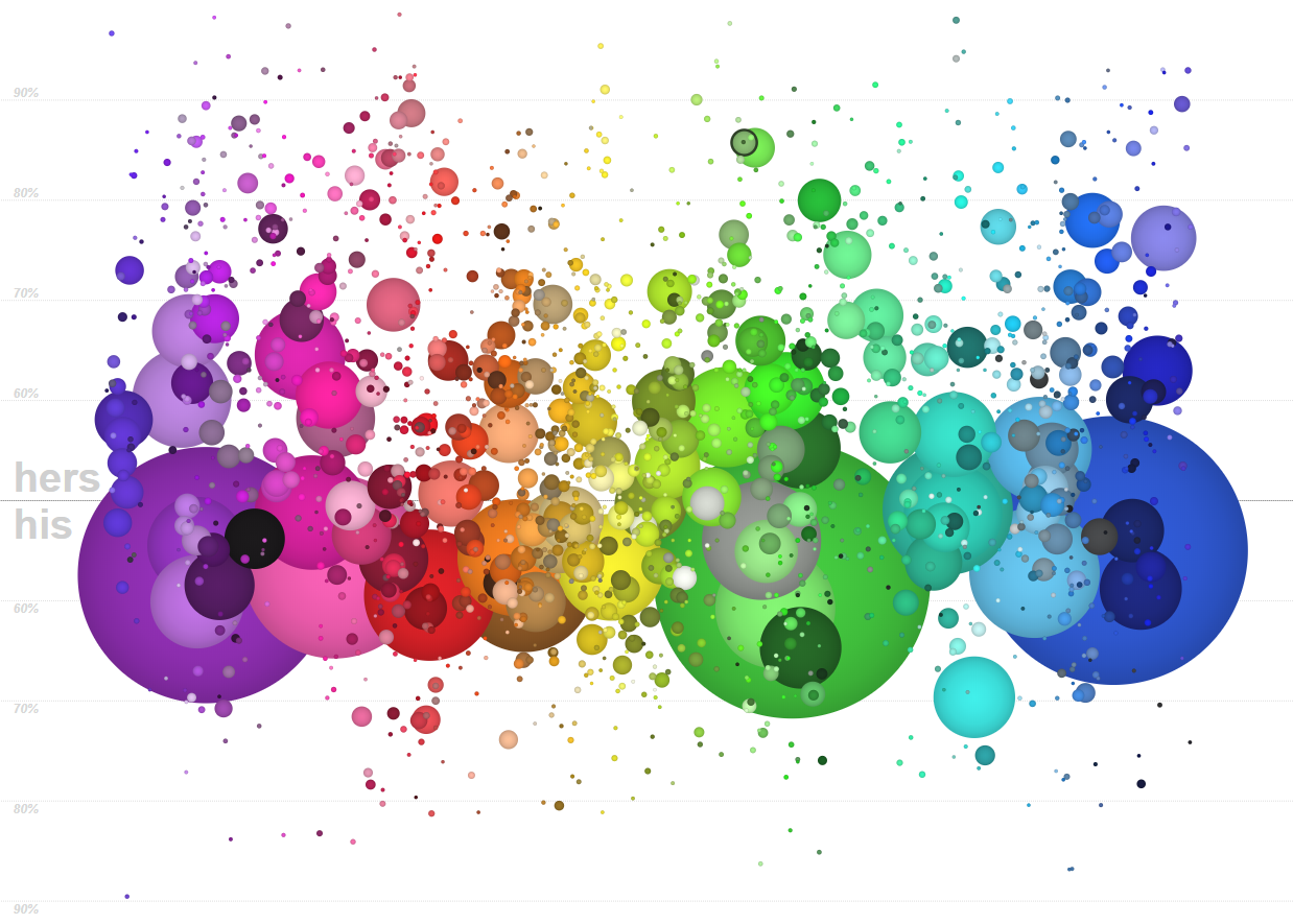
Interestingly, women consistently use more descriptive language to describe shades of colours than men. To date, no-one has come up with a satisfactory, testable and proven reason for why this should be.
When it comes to designing and creating products and brand elements, think about the physical context in which they'll be viewed. Domino's, McDonalds, Subway, KFC, Dunkin' Donuts, Starbucks, Taco Bell... They've all got logos which are predominantly in warmer part of the spectrum, and all need to be highly visible in public places. It's perhaps then not surprising that none have logos in black.
It's more than that black wouldn't be a great fit for a fast food company - when designing a logo that needs to work on a high street, or in a service station, you need something that hits the base, animal parts of the brain first. If the person doesn't see, immediately recognise, and respond to the logo when it's in its main context, it's not going to work. Which brings us on to...
Differentiation, Distinctiveness and Meaning
In 1997, the social psychologist, author and now Professor of Marketing at the Stanford Jennifer Aaker created the "Dimensions of Brand Personality" framework. The study began by creating a list of 309 personality traits which could be ascribed to a brand, and then whittling those down to a more manageable 114 through studying how people related the initial list to a sample of brands.
Next, a list of 37 brands broadly recognisable to the average American were selected from nine clusters or organisation types. After surveying a large group of people, the following five clusters of traits were defined:
- Sincerity: down-to-earth, honest, wholesome, and cheerful
- Excitement: daring, spirited, imaginative, and up-to-date
- Competence: reliable, intelligent, and successful
- Sophistication: upper class and charming
- Ruggedness: outdoorsy and tough
When we talk about brand differentiation, what we mean is the unique combination of these attributes which any brand stands for. For something like Patagonia, it'd be ruggedness and sincerity. For JP Morgan Chase, it'd be (supposedly) competence and possibly sophistication, depending on the product. For Hubspot, it'd be... well, who knows? Content-y-ness?
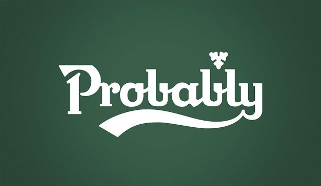
So if this is about differentiation, we then must get into questions of brand distinctiveness. A brand should have a palette of assets which are uniquely theirs, and which nod to the brand in some way. Think of the McDonalds M. The Nike swish. The Carlsberg typeface and the world Probably. The Apple apple. The Best a Man Can Get. The MasterCard overlapping red and yellow discs. Twitter blue. Facebook blue. Tiffany blue. Amazon orange. Starbucks green. Easyjet orange. The yellow of a post-it note. The red of a Louboutin sole.
And yet it's not just the visual elements that tie your memories to a brand. Think of the THX deep note. Advertising jingles and catchphrases. The Game of Thrones theme tune.
All of these are iconic, and you've seen or heard them so many times that you immediately know who they are. That's the power of a distinctive brand asset. A brand which has decided to nail its colours to the wall, as it were. It also gives you latitude to play with your brand assets.
That's why, whilst some blog posts on the internet which we won't link to will tell you that specific colours support each of these traits, the simple fact is that there's no good science to support that. Instead, you can find examples of almost every colour for representing a brand which fits each of the various brand attributes.
The question you need to ask instead is more about the specific colour or palette you want to own, and how appropriate it is for the brand, given its product and audience.
Which leads us nicely on to...
Appropriateness of Fit
With all due respect to whomever grows these things, there's just something about this that doesn't feel right...
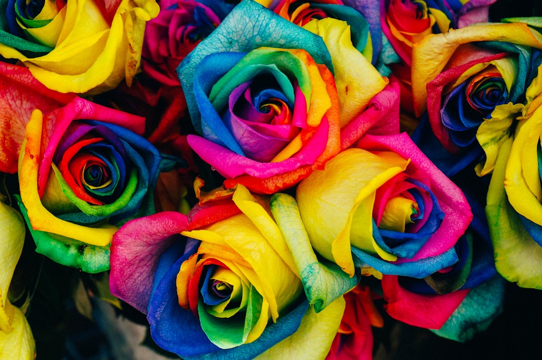
If you're selling a rose, garish rainbow colours don't exactly conjurer up images of romance. We think of deep red or whites as being the colours of a rose you gift.
Similarly, people have ideas about what colours denote when it comes to a brand's position and target market. Blacks and silvers are luxury products. Highly bright colours tend to denote cheap or mass-market. White speaks to technology and simplicity. Warm browns and earthy tones tend to suit lifestyle brands and clothing lines. John Lewis's logo would look weird in a garish yellow. Apple's old logo from the 80s would feel out of touch with their current product line-up and positioning. McDonalds couldn't go for a black, ultra-modern, serif font luxury rebranding of the M - the product wouldn't wear it. Equally, Waterstones would feel odd with it's W in McDonalds yellow.
This brings us to our final study, the seminal "Evidence concerning the importance of perceived brand differentiation" by Jenni Romaniuk, Byron Sharp and Andrew Ehrenberg. Combined with research by Les Binet and Peter Field on marketing effectiveness, there's strong evidence for their conclusion:
Paradoxically, the reduced emphasis on meaningful differentiation makes branding even more important. If brands are not considered to be truly different, then the incentive for the buyer to search for a particularly brand amongst a sea of look-a-likes is low. To ensure that consumers keep buying a particular brand, it needs to stand out so that buyers can easily, and without confusion, identify it.
There's something about carving out a palette that fits the product and the market your brand aspires to or currently does compete in. Having a tone and look and feel in the brand assets and colours which speaks to what you are and who your customers are. What that is is as much art as science, and whilst you can split test different options to get an initial starting point, most of what will make that stick is repeated exposure of your audience to that aesthetic. Putting the brand out there in front of your people so often that they come to just know something that's yours.
These qualities increase the visibility of the brand in its competitive environment. This makes it easier for consumers to notice, recognize, recall and, importantly, buy the brand. An emphasis on distinctiveness means less trying to find unique selling propositions and more trying to find unique identifying characteristics. In themselves, distinctive qualities do not motivate customers to buy brands. The role they play is through helping the customer to notice and identify the brand, in competitive settings, at different stages of the buying and consuming process.
Also from the same study.
It's something that you can spend as much time as you want on, but ultimately you just have to put out there. If Tiffany were founded today, they could spend a fortune studying different shades of blue and focus testing, and probably wouldn't end up with Pantone Blue 1837 as their colour as a result.
What makes it work is the association of that colour with everything you know about the company and its product. It's a touchstone, which is used everywhere you could possibly interact with the brand. That's the key.
Putting It In to Practice
There's really two parts to this - the application from a branding perspective, and how to use these principles to design interfaces. Let's look at a couple of points for each in turn.
The Brand Perspective
The two elements we'll look at for brand colour choices are the use of colour to set expectations, and for matching user's concepts of what a brand should look like. So firstly...
Setting Expectations
Perhaps the most powerful use of colour in branding is to set or subvert an observer's expectations. For example, despite being the same class of object (luxury GT cars), these two say very different things about the respective buyers:

Colour is as much a signal to others of what we wish to say about ourselves as anything else. But it also signals how we view an object or a brand. This was investigated by Paul Bottomley and John Doyle in their paper The interactive effects of colors and products on perceptions of brand logo appropriateness. In short, they (unsurprisingly) found that the colours and typographic choices presented to users in relation to product branding has a significant influence on how those products are viewed. Or in other words, the person buying the pink Bentley sees it as fun, whilst the buyer of a green Aston sees it as an adult, refined purchase. A pink Bentley presents as a £7 bottle of wine from Tesco. The Aston is a Chateau Beaucastel 2013. It doesn't matter that they're both seriously expensive pieces of kit when bought new.
So when considering how you're going to design your next interface, think about what its appearance says to the user about the kind of person they are. We know from research that peoples from different cultures, genders, socioeconomic groups and ages have different views when it comes to colours.
As such, the palette you choose, and how you present and use that palette matters enormously, especially when you consider that it has to also be true to and reflect the brand and its intended tone, values, and look and feel. Interestingly though, despite it being an odd-ball choice, a pink Bentley isn't entirely off-brand. Which brings us on to...
Appropriateness and Colour
Just as it's possible to have a pink Bentley, it's possible to have non-obvious choices for brands in almost any sector. However, there are some choices which should be just a straight-up no.
People often have pre-built biases for what a brand should look like. A bathroom furniture and fittings company probably shouldn't build their brand around a fierce, high chroma red, just as an organisation selling power tools probably wouldn't pick lavender. It's not that they couldn't work with those as the base colour for a brand, but they'd be starting off with a much harder job to do, as the colour tones are cognitively dissonant with the product offering and target market.
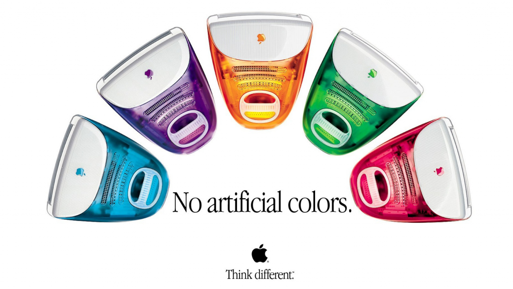
This is the reason why, when Apple re-branded their logo in 1998, it went from being the bold colours chosen in the late 70's to a simple, clean black, at exactly the same time as their computers did the exact opposite. When they introduced the iMac, they came out in a rainbow of colours, becoming the first computing brand to say that desktop's didn't have to be boring.
The brand icon said up-market, whilst the product said different, fun and beautiful.
Interestingly, they then played with a palette of different colours from 2001 to 2013, which reflected the look of the operating system, before coming back to a simple, plain grey. Their branding has steadily evolved to evoke a feeling of luxury, losing its more striking nature as the product lineup has become ever more about the iPhone and MacBook, and less about anything else. Google's logo has undergone a similar transformation, becoming steadily less playful and more elegant as the organisation has evolved.

This is a particularly interesting one from a colour perspective too, as the individual letters have subtlety changed in their chroma and value over time, to match the specific tone which Google want to strike with each revision. The Google of today couldn't get by with their logo from 1999, even if it had the same typeface as today. The base colours just wouldn't quite fit; they'd feel too corporate.
The Interface Perspective
Firstly, let's address the elephant in the room. All those blog posts telling you that blue makes people calm and white will make them something or other are basically trash. It's not only blindingly obvious that a person's unique preferences and background, cultural influences, upbringing, and the specific context of the object, their mood at that moment and so on will all have an effect on how something is perceived. So the idea that you can just make something green and create a specific feeling is... unlikely.
It's not just obvious though, it's also been shown through empirical study. So what can we do then? Well, here's two examples...
Drawing Attention
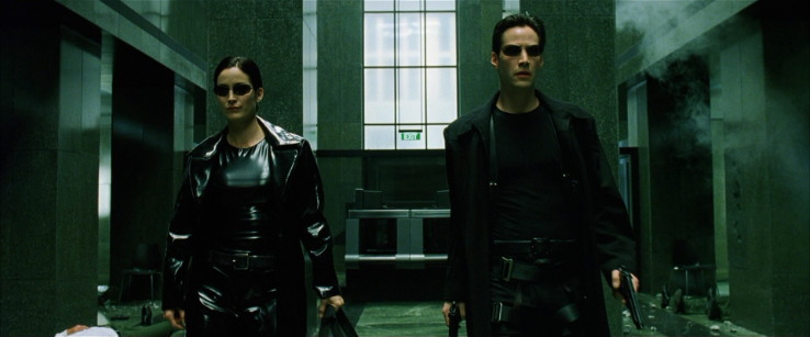
Firstly we can use colour to highlight, signpost, and otherwise make elements in an interface stand out. Consider the Monet painting "Impression, Sunrise" below:
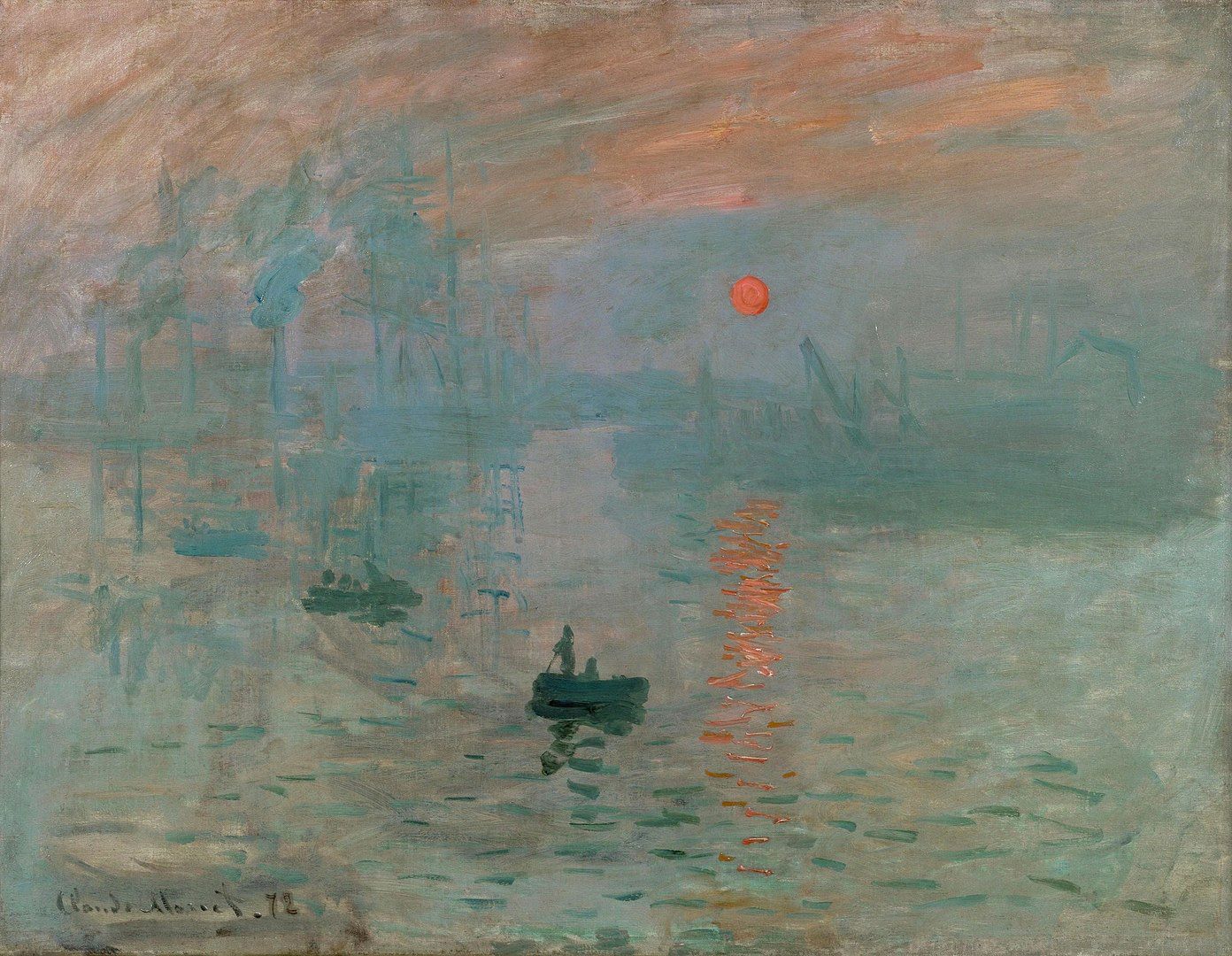
The sun stands out as a single red item in a sea of blue and green hues. The same principle can be applied to interface designs. The button in a different colour, the Tiffany box on a white stand, against a white background. The image in a block of text. The orange against the blue.

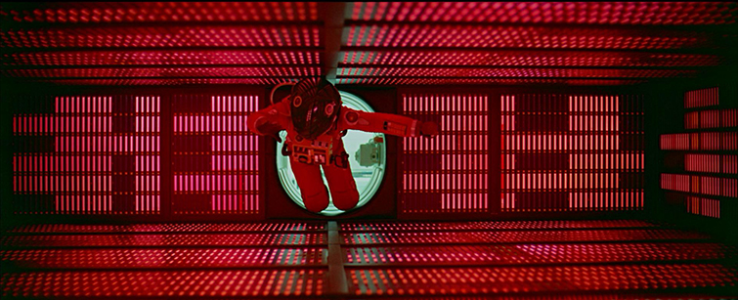
The same basic reasons why elements in this stand out (the lightsabers, Rey's face lit in in warm tones), and others don't (like the Starkiller base) can be used to highlight and visually suppress elements, to ensure the observer notices what you want them to. Going back to the research on how people perceive different colours, this is most effective when you draw the users attention to an object in warm tones, which sits in a white or cool coloured context.
Creating a Message and Mood
The other great way to use colour in an interface is to reinforce a message. Think of the red of a stop sign, or the way a film is colour graded to give added emphasis to a scene. Think about how these scenes would appear with different colour choices:


In the same way as film makers use colour to emphasise themes and feelings, we can use colour to accentuate products and interfaces. The following is a product banner from the homepage of Vacheron Constantin:

Everything about this image, which is the main feature of the homepage, has been designed to highlight the watch, and present a certain aesthetic and feel. Equally, every element on this page on the Starbucks website has been thoroughly considered, for the same reasons:
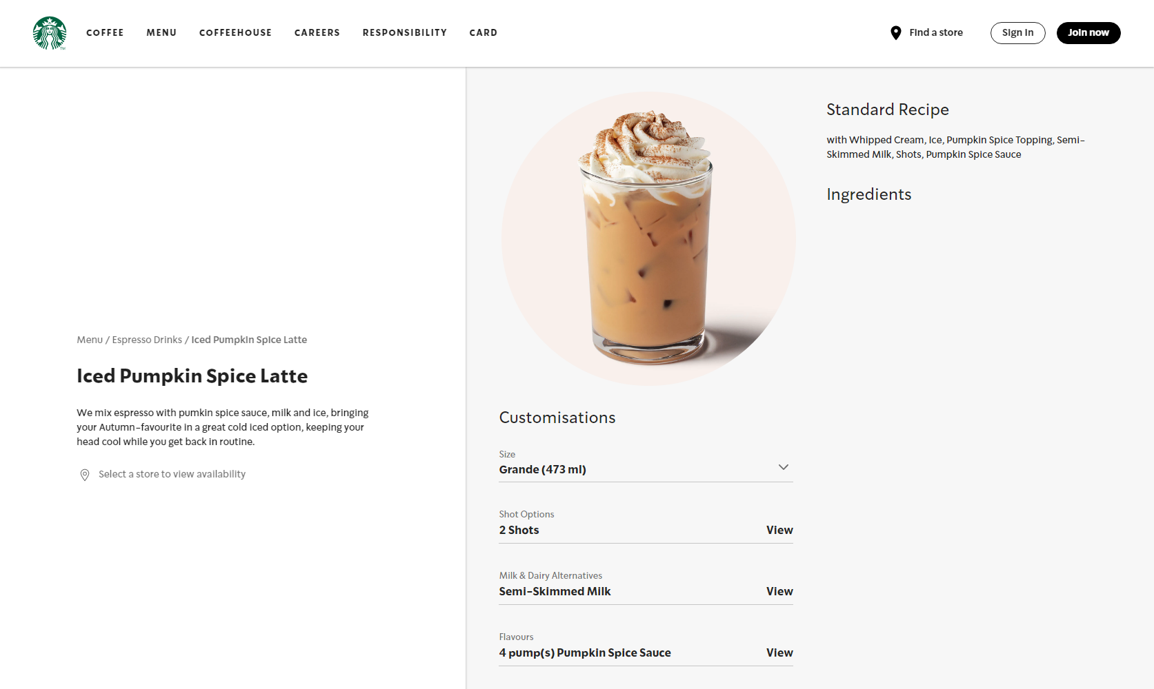
The background of the product, with its soft pastel colour, which works beautifully with the page background, the dark patches from the ice and the white of the cream picking up against the colour of the typography and the white of the non-product section backgrounds... It's a beautifully considered thing, which you can only do if you're starting with the content; in this case, the imagery to be used.
We get a similar presentation with the MacBook Air page:
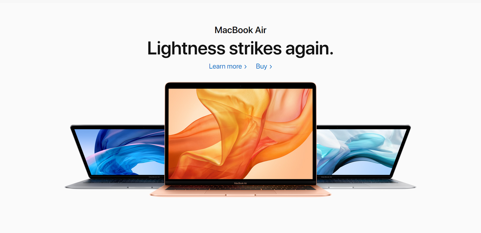
Notice how the warm coloured MacBook has a warm coloured desktop, and is flanked by two cooler coloured machines, creating the warm/cool two-tone contrast we mentioned earlier. The opposite colours draw the eye more to the foreground image of the front laptop, and creates a striking balance with a lot of pop, like the Star Wars poster.
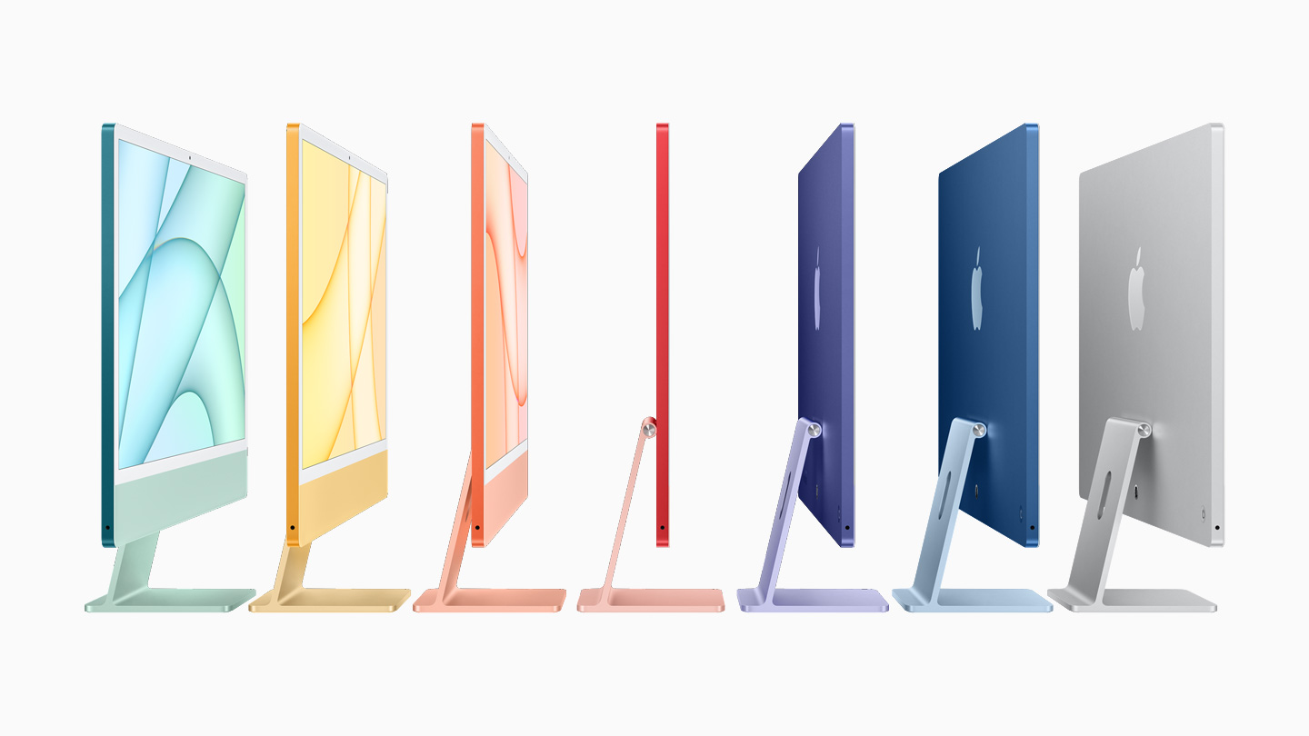
A similar effect in tones can be seen in this more recent image from of the new iMac colour range:
Finally, think about the following collection of images, which despite being almost identical, present a different feeling through nothing but colour. You can use colour to do exactly the same, whether it's in a digital interface, outdoor advertising, product photography, or anything else a user will interact with.

Colour Rules
With all that said, it's entirely possible for a brand to play colour in wacky ways to create powerful results, but it's generally best to play to your strengths. There's a reason why Carlsberg could get away with doing this, and still have you know it's them:
Create a palette, combine it with distinctive brand assets, and put it in front of your audience over and over, and they'll get the message, no matter what colour you choose.