UI Theory & Optimisation
Everything online has some form of interface which which users interact. Some are good. Most aren't. Let's examine how they should work and why.
Whilst organisational design plays a part in customer experience, much of what exists in the digital realm is abstracted a step away from that: apps, websites, emails, social media accounts, digital advertising and so on...
So whilst we can do all we want in terms of digital transformation of an organisation, it’s not going to amount to much when it comes to delivering amazing digital experiences if we don’t also consider how we go about designing, developing and optimisation digital assets. We’ll take a look at the optimisation element here, and then move on to design and development after.
We covered the technical side of how to go about gathering data for this earlier, so now we’re going to look at the ways we can modify layout and content to optimise interfaces. We’ll start with the eleven ways we can change how things are placed, before moving on to look at the three ways you can change what is shown to the user.
Clarity & Affordance
The first options to improve an interface are to take its constituent parts and make each stand out (clarity) and more obvious in what it does (affordance). For example, if you see text that looks like this on the web, you know what is, you can see it easily against other text, and you already know how to interact with it. If you want to improve any interface, you can start by making it clear what different elements are and do, and ensure that they appear to be what they actually are. For example:
Each of these looks like a button, to a greater or lesser extent. However, depending on the interface design, and the context in which these things are placed, it may be more or less clear that the item in question is, in fact a button. Consider the following to versions of the same form:
It’s fairly clear that what we’re looking at is a contact form, and the so with that context, that the buttons are buttons, and that clicking them will submit the form. We have an understanding based on prior experiences as to what a contact form is, what it should look like, and the likely components of it. Finally, at the bottom, we’d expect there to be a button to press to send the information provided.
However, even with that context, the first version is more obvious than the right, which is more similar to the input fields.
However, if we had the same button at the bottom of a page, on its own, for a user to take an action like downloading a PDF, then all of a sudden, it’s not quite so clear. We’d want to ensure we used the most button-like button you’d ever seen, with text around it in bold and a big arrow pointing at it, to make sure the user understood what the button was, what it would do, and what to expect next.
Signposting
Our second option for improving a UI is to use elements to directly or indirectly highlight an element of an interface. There’s all sorts of ways to go about this, from the subtle to the deeply obvious.
On the subtle end, we have visual clues provided by images. Firstly, you’ve got the now oft-cited example of a person in an image looking towards the CTA on the page. The person provides a visual clue to where you should look with where they’re looking.
We can create more direct and obvious methods of drawing the user’s attention to where they should go now though. From text, stating what the user should do now, to literal arrows or visual clues, pointing at elements. Think of an ecommerce site - you’ll often have, after a product has been added to the cart, showing what’s now there, and giving a choice to keeping shopping, or going to the basket. This gives clarity on the action taken, and reduces friction for going to the basket to checkout. Of course, this needs to be refined based on average basket size - if most users are adding more than one product to a basket, you probably don’t want to direct them to the checkout yet, so you’d want to present that option in a way that doesn’t lead the eye as strongly as the continue shopping CTA.
Hierarchical Organisation
There’s a fundamental hierarchical structure baked in to the whole way of building digital UIs. In HTML, we have headings, paragraphs, sections, headers, navigation elements, lists and so on... These things have implied hierarchy, but more than just the content we put on the page and how it’s structured, there should be a hierarchy to how everything is laid out.
The first way we can go about doing this is through size. So if I lay out:
A Big Heading
A smaller Heading
A slightly smaller heading again
And one that’s like the last one, but lighter
You can see how these relate to each other. The bigger things and darker things are visually shown to be higher in priority. The lighter blue heading is less like the ones above it, having colour and being gentler, picked out so it’s shown as a subcategory of the one above it.
These types of size and colour based ordering show a simple way of showing hierarchy. The other way to create visual hierarchy is through setting things under others.
- For example...
- ...these items...
- ...are nested under the first one.
- These on the other hand...
- ...relate to the second...
- ...heading used above.
We can use this form of grouping and nesting structure, both with and without bullets, to show how items relate to each other. Think of nested comments on a forum or blog. By indenting, it’s possible to show a hierarchical relationship of data, in how comments relate to each other.
Gestalt Laws of Grouping
The Gestalt laws of grouping cover closure; connectedness; continuity; proximity and similarity.
Here’s some visual examples of each of these in action:

The Gestalt laws of grouping are closure; connectedness; continuity; proximity and similarity
Tweet This
Closure is the mind’s ability to create something out of limited information. In this case, the observer sees a triangle, where no triangle exists.
Connectedness is a way of visually stating that two things belong together, without grouping them. This can be through colour, shape, or other methods of visual delineation.
Continuity is our ability to see how, from a pattern beginning and repeating, what will come next, so we can develop anticipation. In this case, you know where the line would go, and it’s confirmed by the end piece.
Proximity and grouping are related forms of connectedness, but this time rather than connecting and disconnecting objects by form, it’s through the use of space and layout.
Finally, similarity is the act of using visual indicators to both show that one set of objects is in some way connected or repetitious, whilst also allowing for the highlighting of elements that are dissimilar to others.
It’s also worth highlighting the Von Restoff effect at this point, which states that when multiple, similar elements are presented, the one that differs will be remembered. After all, each of the circles in the last example are much like the others, so it’s the one in orange with a thicker broken line that you notice, not the forth grey one in a row.
Contrast & Highlighting
The example we used previously also works if we swap elements or images for copy. For example, this text here stands out more than the text around it. We’ve highlighted it, changed the colour of the text, and made it contrast against everything else around it. However, that’s not the only way to create contrast and increase how noticeable something is in a body of text.
For example, you can start out by making text a different weight, swapping in a different typeface or using a modification of the current one, or changing colour compared to the text around it.
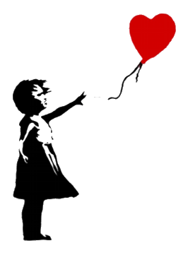
This can also work with non-textual things. For example, this image to the left.
The balloon stands out, because it contrasts with the girl, through nothing more than being red. Imagine what this would look like if the balloon were black, or just an outline. It wouldn’t have anything like the level of punch that it has, compared to with it in red. This is another example of using contrast and highlighting to bring attention to something that otherwise would lack the punch which makes it work.
Also, you’ll notice we wrapped the text around that image. That’s an example of using...
Spacing, Layout & Flow
In fact, much of this guide is an example of using layout to show how elements relate to each other. The gaps between paragraphs and titles and images and everything else, the way the guide moves from subject to subject and so on, are all examples of usage of spacing and flow to lead the eye, and so the user’s attention, from one place to another.
An awful lot of design boils down to the usage of whitespace, giving things room to breathe, to make sure a user can find their way from one place to the next, through having content flow smoothly from one piece to the next.
There are of course, many ways to achieve this. The easiest is to have a single column layout, where whatever comes next is whatever follows what came before. However, there’s times where you’ll want to have an aside, to provide extra information or context, or where you want to introduce something to reinforce what’s being shown, without distracting too much. At this point, you’ll need to have elements to the side, or coming in or going away through motion or opacity. Making sure these flow smoothly, creating an experience that leads the user, without distracting, is key to ensuring they still engage with whatever comes next.
It’s worth noting that this also ties into...
Aesthetic Usability Effect
One of the more fascinating aspects of user experience design when it comes to interface creation is that the more aesthetically pleasing an interface is, the more highly users will rate it as easy to interact with, even when this isn’t true.
Doherty Threshold: the quicker an interface responds, the better. All input should take less than 400ms
Tweet This
This is something which has been studied significantly over the last 25 or so years, and is one of the easiest ways to go about improving the reported experience and reducing the perceived stress levels of your users. Without actually changing any of the content or the user journey, simply improving how an interface is laid out, the use of whitespace, the colour palette and the aesthetic of each component on the page has a measurable impact on how well people will feel they’re engaging with your content.
Doherty Threshold
The Doherty threshold comes from research from the 80’s, which looked at how users interact with systems, in terms of responsiveness. In short, the quicker an interface responds, the better, and when an interface responds at a rate where a user isn’t waiting for the result of an input, productivity soars. It’s one of the reasons mobile device screen lag, keyboard lag on low memory computers and slow loading applications are so frustrating. Ideally inputs should take less than 400ms to respond.
The other side to this is that if there’s a delay which is required, for example saving a large document, computing something large or complex, or transferring a large quantity of data, enabling the user to see the time remaining significantly cuts frustration. A known, quantified delay is far easier to endure than an unknown or ill-defined one.
Hick-Hyman Law
This law states that the more choice is presented to a user, the longer decision making will take. Thus whenever we require users to choose between options, we should try and limit those choices to only what’s necessary, and ensuring dealing with the choices in question is as effortless as possible.
Hick-Hyman Law: the more choice is presented to a user, the longer decision making will take
Tweet This
Now, it’s worth noting at this point that this isn’t the same as limiting control. Choices introduce mental load, by having users have to expend effort differentiating and evaluating. Controls afford users flexibility and power over an interface. That’s not to say “more controls is good”, but it’s often not a bad thing. We can also rationalise an interface using this principle to obscure complexity, presenting only what’s required for a user to complete the task at hand at that moment. Think of a multi-stage form process, like a checkout. You don’t need to present all the form all the time; instead users can walk through step by step.
Fitt’s Law
Fitts Law: elements likely to be further from the current pointer position should be designed to be larger, to make them easier for a user to hit accurately
Tweet This
The penultimate element we can control is to do with Fitt’s law, which states that the time to hit a target depends on its size and relative distance from a current position. Basically, larger touchpoints are easier to hit, and the further from the current place the touchpoint target is, the bigger it needs to be. So if you’re evaluating how users navigate an interface, and you notice that (if using a mouse) the distance to move the hand is large, or (if using a touchscreen) the distance to move a finger or thumb is relatively big, then you need to allow for that in your design.
After all, the last thing you want is to add frustration to a user’s journey, at any point, especially when the fix is as simple as increasing the size an element.
Structure & Encapsulation
Finally for the “how” we lay things out, we have the total structure and the way we encapsulate content.
This is a continuation of the concept of flow, but on a more complete level. Rather than considering flow from item to item, we now think more of the structure of an entire interface. Making sure people can guess what’s what. One of our ways of testing this is to take the blocks of content on a digital interface, remove all the content itself to create a wireframe, and then give it to users and see if they can still identify the elements on the page.
All interfaces should follow enough of a logical flow and layout that the main features are immediately obvious, and after interacting with a page or two, users can fluently make their way around it without help.
Equally, this means similar blocks of content should be groups and encapsulated in one way or another, to create clear, obvious sections, which users can engage with or ignore based on the relevancy to their goals at any given time.
With that covered, let’s move on to the three ways we can change what is on the page.
Message
The first thing that can be changed with regards to what we put on an interface is the messaging. This is more than just copy - everything that exists on a page gives messaging to the viewer. The content informs us of what is being shown, in terms of the overall subject, the likely subjects for the rest of the content on the page, and the relevance of the page to the user, based on their intentions.
This starts with titles, above the fold imagery, navigation, and layout. Everything that’s on the interface, as far as possible, should reflect a single message. Each item of content, from the headline down, should build on what’s before, starting with a clear statement of intent, to ensure the user knows what the page is about.
Equally, there should be as little to distract from that message and the intended goal of the page as possible. This is called the attention ratio - the number of items on an interface that relate to the goal, vs those that don’t. Remember, everything that’s on a page that isn’t reinforcing or developing the message, and leading to the conversion for that interface, is impacting its conversion rate.
So if that’s thinking about what we’re putting on and how it relates to the message, what about the messaging itself? After all, it’s entirely possible that you think a page on your website should be about thing x, whilst your users want to know about y. The most common example of this is writing about features when users want to know about benefits, or vice versa. The easy way to test this is with an A/B test of different messages to see which leads to higher levels of conversion, but you can also test what people think a page is about, against what you thought you wrote about. The way to do that is to use user testing to show people the page for five seconds, and then ask them what they thought it was about. If they can’t figure it out, you have a messaging problem, and you need to go back and work out how to better get across what you want to say.
Tone and Mood
The second element we can change, once users understand what’s on the page and get that right, is how we say what we’re saying. Let’s imagine you’ve got an About page on your organisation’s website. How do you want people to think of your organisation? You could say exactly the same things, but with different tone of voice, and convey very different impressions of who you are and whether they want to engage with you. If you’re a young, trendy agency, then copy that comes over as irreverent and cool and hip might be fine. However, I probably don’t want to hire a law firm that talks that way about themselves.
Imagery often falls prey to this trap with this as well. So much of our initial impression of a page is down to the big elements of the imagery presented that you can’t afford to just pick an image because it’s pretty. It needs to reflect the theme of the content and have relevance to it, not distract from the message. It needs to speak to the user based on the content of the piece, and with the tone and mood it sets.
This is why we always advise people to use as little media as possible, as invariably people want to put a pretty image that has no relevance to anything on a page, because they read a blog post once saying that interfaces with nice images do better. If it’s not relevant or helpful, bin it. And again, the efficacy of imagery is easy to evaluate via user testing. Run a test asking two groups of users to look at the page for five seconds with and without the image. If the group with the image find it harder to work out what the subject matter is, or engage less due to having the wrong image, then pull it. No image is better than a bad one.
It’s also worth considering where the user came from at this stage. If they’re already engaged with the interface prior to viewing this screen, then how does the tone of this screen work against the one they were previously on? If they’re coming from an advert, what was the ad copy? How did it incentivise them to come to your digital property, and what’s the match like between the messaging, tone and mood of the ad, and the screen they land on? It’s vital to ensure all these things line up, to get the best results from your users.
Medium
Finally, we come to the medium. How we’re actually presenting our content. Is it via images? Text? Video? Not all content performs the same, given the same input. It’s worth testing how people respond to different methods of interaction. We saw this trend explode in 2016 when explainer videos became all the rage. Then in 2017 and 2018 we had chatbots. We’ll see something else in 2019 I’m sure. Granted, these are often mostly people bandwagoning based on what they’ve read in a blog post. But the idea, the concept of “we’re going to try another way to interface with our customers on this screen” was absolutely correct.
You should always be running this process of creating hypotheses about how people are interacting with your content, creating treatments with different tones, messages, moods and media and then seeing what works and doesn’t. Remember, the aim is to create change, and over time to deliver results through the compound improvement of those iterative developments. And with things like the Black Magic Pocket Cinema Camera, phone cameras, DSLRs and so on all bringing ever greater quality at lower prices, to say nothing of the field of digital design ever improving and upping its game, there’s no reason not to test different options for your content.